Till Brand Book

Built a brand book to guide Till's shift to direct-to-consumer marketing and a unified brand with Fabric


AI tools used
Figma Agent, Pencil AI
Who I worked with
Executive leadership stakeholders
Who was impacted
The business and marketing agencies
decorative image


OBJECTIVE

Create a brand book to support the transition to direct-to-consumer marketing and guide an upcoming website redesign, while establishing a consistent brand direction across Product, Design, and Marketing.


The Problem

In 2026, Till Financial, a fintech startup offering debit cards for teens, was acquired by Western & Southern, the parent company of Fabric (my company). As part of the acquisition, Till was transitioning from a B2B2C model to a direct-to-consumer B2C model, requiring a new approach to marketing and customer acquisition.

Until then, Till had never needed a formal brand book. But as the team began working with an external marketing agency, the lack of clear brand guidelines became a challenge. The agency struggled to execute consistently without a defined foundation to work from.
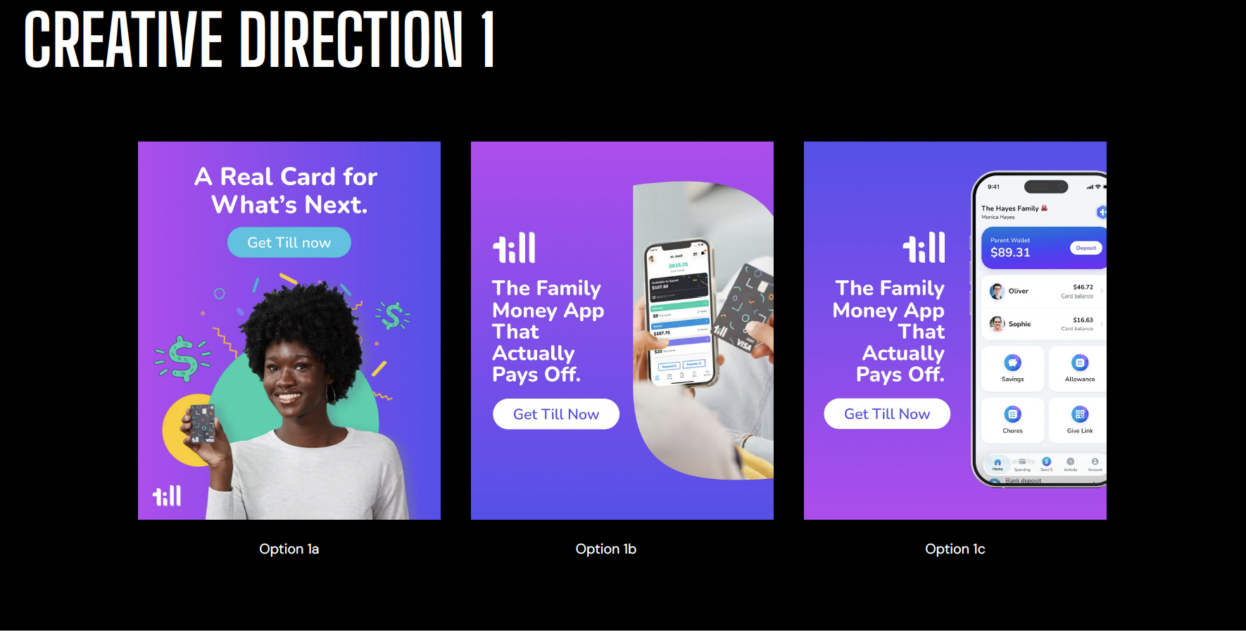

Agency concept 1
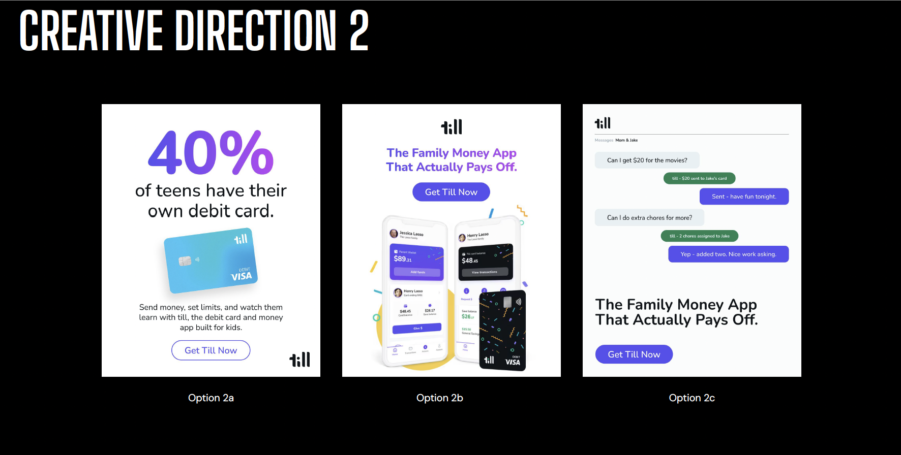
Agency concept 2

With no brand direction, the agency's initial attempts at marketing creative struggled


At the same time, Till and Fabric were moving toward a unified brand and mobile app. We needed a cohesive brand direction that could support not only our DTC marketing efforts, but also Product and Product Design.

Our OKRs didn't leave room for a lengthy agency engagement to develop a brand from scratch. We needed to move quickly, build on what already existed, and give our teams and agency partners the direction they needed to execute.
Building the Brand Foundation

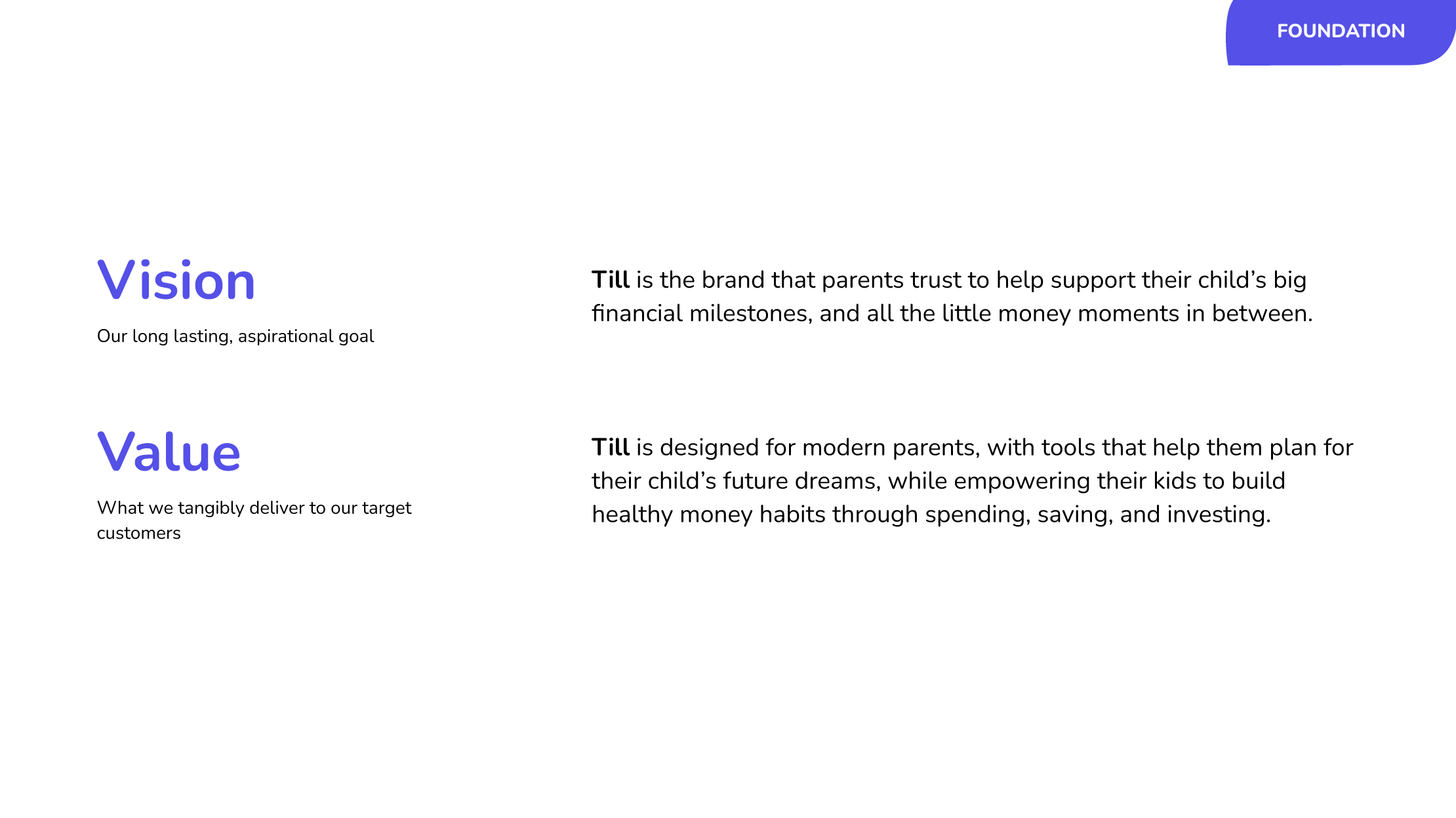
I drew on learnings from our earlier subscription research to establish the strategic foundation for the brand: its vision and values.


Brand foundation: vision and values

With that foundation in place, I audited the existing brand elements, including the typography, color palette, and logo. Rather than reinventing the identity, my goal was to preserve the familiarity of the existing brand while expanding its visual language to work harder across marketing, digital experiences, and advertising.

Extending the Visual Identity

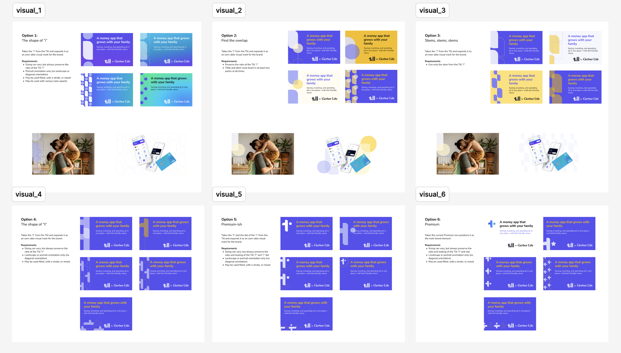
I explored multiple iterations in Figma to develop a more flexible visual system, using elements of the existing logo as a starting point. I used Figma Agent to help speed up the iteration process.


Brand iterations
Multiple iterations exploring different variations of brand elements in Figma

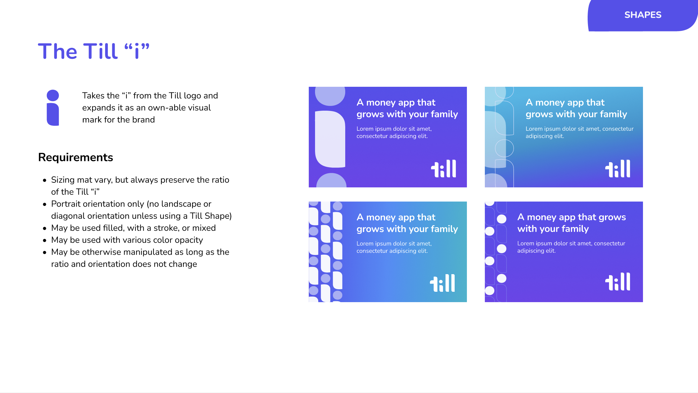
I ultimately landed on a direction centered around the “i” in the Till logo, which represented the child in the original design.


The Till i
The Till i

While this element worked well in many contexts, I realized it didn't always provide the visual impact needed to make key messages stand out in advertising and marketing.

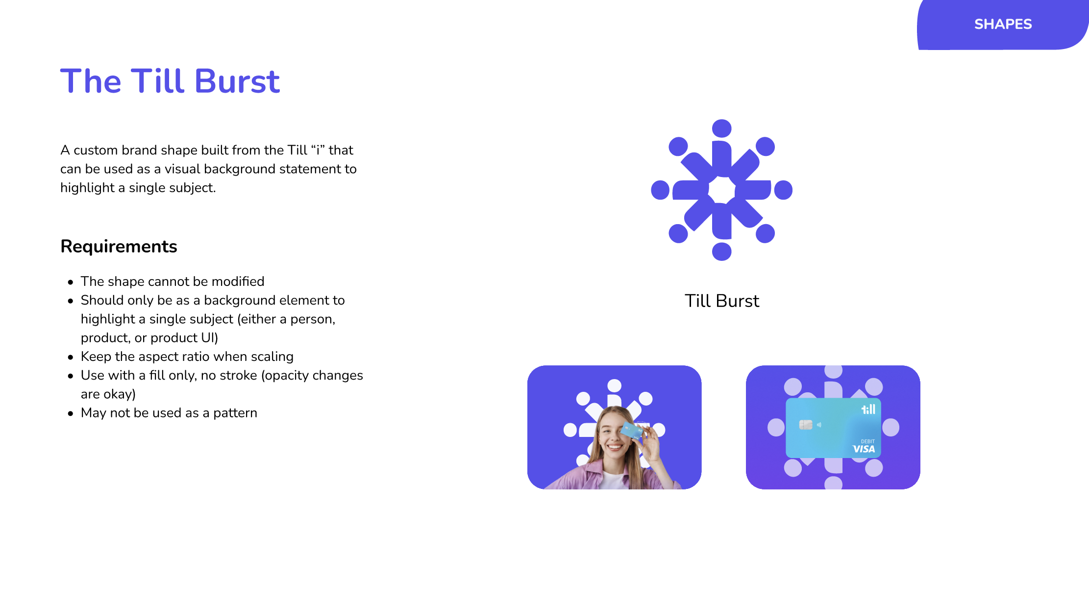
To address this, I used Figma Agent to create a secondary graphic element called the Till Burst—a distinctive shape designed to draw attention to important content and give marketing assets more visual punch.


The Till Burst graphic element
The Till Burst

The challenge was to make the Burst versatile without letting it overwhelm the brand. Based on feedback that the shape could look too much like a snowflake, I established clear usage guidelines to ensure it remained a supporting element rather than becoming an overused motif.

These additions gave the brand more flexibility without losing its connection to the original identity.

Developing a Photography System

Photography was another important part of the brand system. Existing marketing learnings showed that ads featuring human faces generally performed better than those without, so I established photography guidelines that emphasized authentic human connection.

However, although we were building toward one unified brand and app, our products served two distinct audiences: parents of younger children and parents of teenagers. Our subscription research had surfaced an important insight: teens want products that feel grown-up and reflect their emerging independence, rather than reminding them of their younger selves.

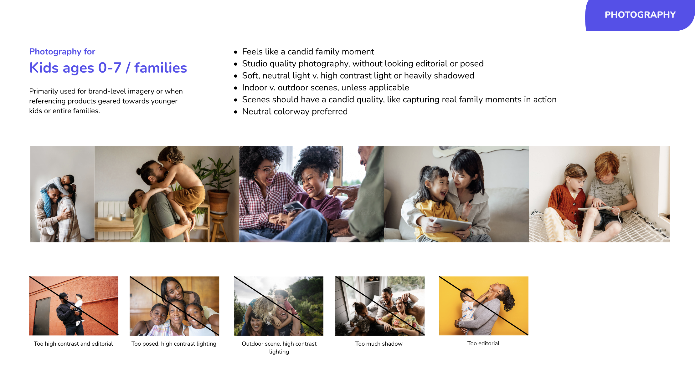
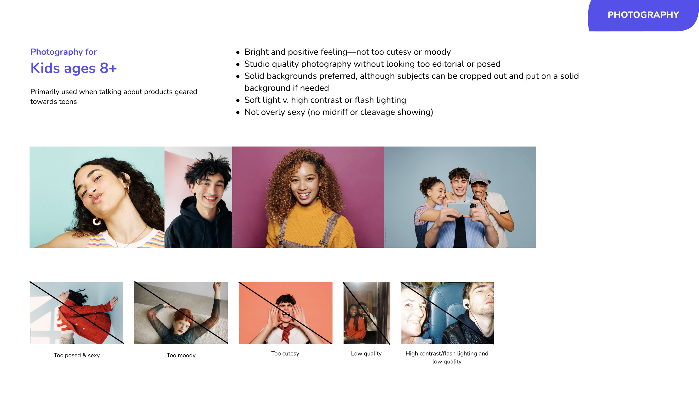
I translated that insight into two distinct photography directions:

  • Younger children: Warm, intimate, family-oriented imagery that conveys connection, care, and trust.
  • Teens: Fresh, vibrant imagery that captures individuality, confidence, and the experience of beginning to establish an identity separate from their parents.

The goal was to build a flexible photography system that could speak to different life stages while remaining cohesive under one identity.


Photography direction slides
Photography direction: families
Photography direction slides
Photography direction: teens


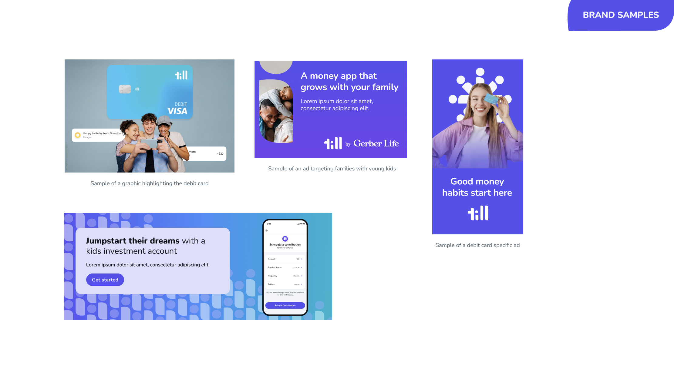
One key area of push-back from the ELT was that they wanted to understand how photography played with the rest of the brand. Understandable, they didn't want the brand to look generic with too much stock photography (and neither did I). I put together some examples of how the entire brand book might play together in advertising or on marketing pages. With this, the ELT felt comfortable moving forward with the brand book proposal.


Brand book applied to marketing and advertising samples

Creating Alignment and Buy-In

Throughout the process, I shared iterations with key stakeholders across both Till and Fabric, gathering feedback early and building alignment as the brand took shape.

I worked closely with our Product Designers, who were the most familiar with Till's existing identity and would ultimately need to apply the new direction within the mobile app. I also aligned with the executive leadership team ahead of the final presentation, ensuring that key stakeholders were on board before seeking approval from the parent company.

By the time I presented the brand to the parent company's CEO, the direction had already been vetted across the organization and with the ELT at Fabric and Till, who also attended the final meeting.

The response was overwhelmingly positive, and I secured executive sign-off without additional push-back.

Results

In just two weeks (including stakeholder feedback and design iterations), I developed the brand foundation and visual guidelines needed to support Till's next phase of growth. Compare that to an agency, which would have easily needed months of lead time and significant budget for a full brand engagement.

The brand book provided a shared direction for Product, Design, Marketing, and external agency partners as Till and Fabric moved toward a unified brand and app. It also gave the marketing team a practical foundation for DTC advertising and the upcoming website redesign.

I am currently working with our marketing agency to translate these brand guidelines into their instance of Pencil AI to help generate a library of branded assets for creative testing.

This project reflects how I approach design leadership under tight constraints: establish the strategic foundation, focus on the elements that will have the greatest impact, bring stakeholders along throughout the process, and translate a vision into a system that teams can actually use.


The complete Till brand book — click to explore the interactive prototype