Translated our subscription strategy into an intuitive, conversion-focused in-app sign-up experience
AI stack
Claude, Figma Agent
Who I worked with
Lead Product Designer
Who was impacted
Subscription users
OBJECTIVE
Translate our subscription strategy into an intuitive, conversion-focused in-app experience that helped parents understand, compare, and select the right plan for their family.
The Starting Point
With our subscription strategy established, the next challenge was bringing it to life in the mobile app.
We needed to take a fairly complex set of information (multiple plans, product features, pricing options, and user needs) and turn it into an experience that made choosing a subscription feel simple and intuitive.
I partnered closely with my Lead Product Designer to translate the initial subscription concepts into a mobile-first experience. We started with mockups created in Claude during the strategy workshopping process, which had been designed for desktop. Our challenge was to rethink the information hierarchy and interactions for a much smaller screen, without losing the details users needed to make an informed decision.
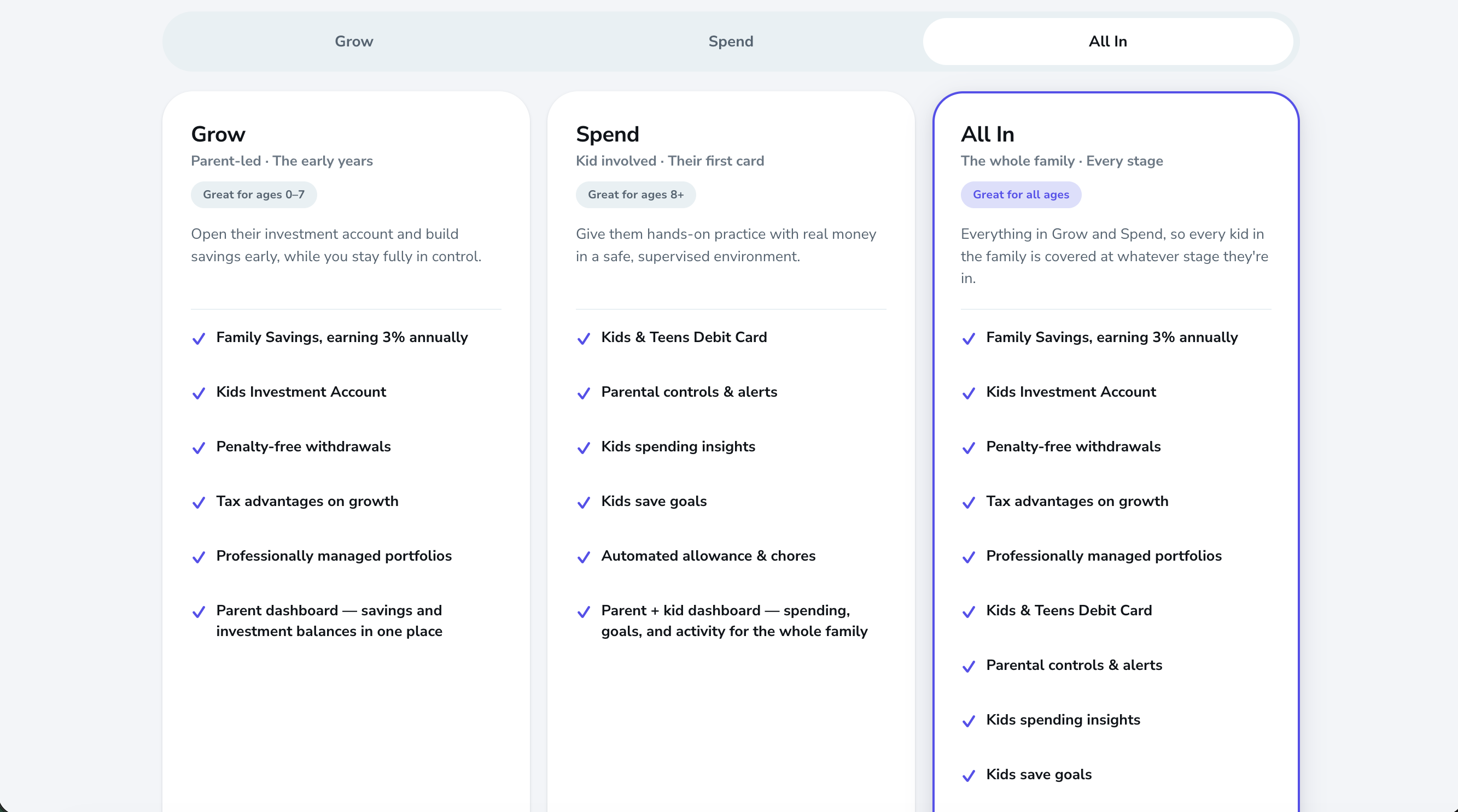
Claude generated mock-ups of the three subscription plans from the subscription strategy work I led
Iteration 1: Establishing the Experience
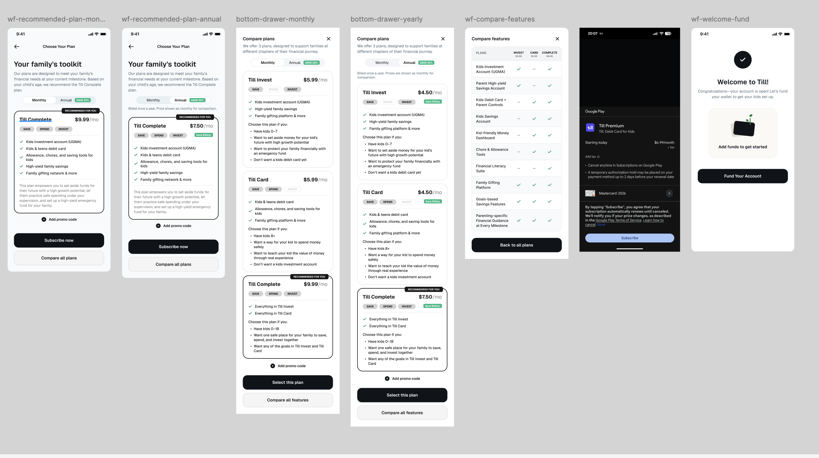
My designer used Figma Agent to translate the original Claude mockups into Figma wireframes. I established the key requirements the experience needed to meet:
Make plan comparison easy: Users should be able to quickly understand the differences between plans and confidently select the one that best fit their family.
Default to 'All In' plan: Preselect the 'All In' plan as an opportunity to encourage upgrades.
Incorporate age and goals: Surface the child's age and parents' financial goals as key indicators to help users identify the right plan. Our subscription research had shown that these were two of the most important factors parents considered when evaluating their options.
Offer monthly and annual billing: Give users the flexibility to choose between monthly and annual subscriptions, with a slight discount for annual billing. Our research showed that explicitly highlighting annual savings resonated with users, while annual subscriptions also supported our business goals around lifetime value and retention.
Support promotional codes: Give users the ability to apply a promo code during sign-up.
Initial subscription plan wireframes generated with Figma Agent
My Feedback
The initial wireframes gave us a good starting point, but I saw opportunities to simplify the experience and better prioritize the information hierarchy.
First, I recommended removing the feature comparison chart. Because our first two plans served distinct audiences and offered different products rather than progressively building on one another, a traditional side-by-side feature comparison would add visual complexity without helping users make a meaningful comparison.
I also recommended removing the separate "Compare all plans" button. Users should be able to navigate directly between plans without an additional interaction. Helping users understand their plan options was more important than making them take an extra step to compare monthly and annual pricing.
Iteration 2: Personalization and Information Hierarchy
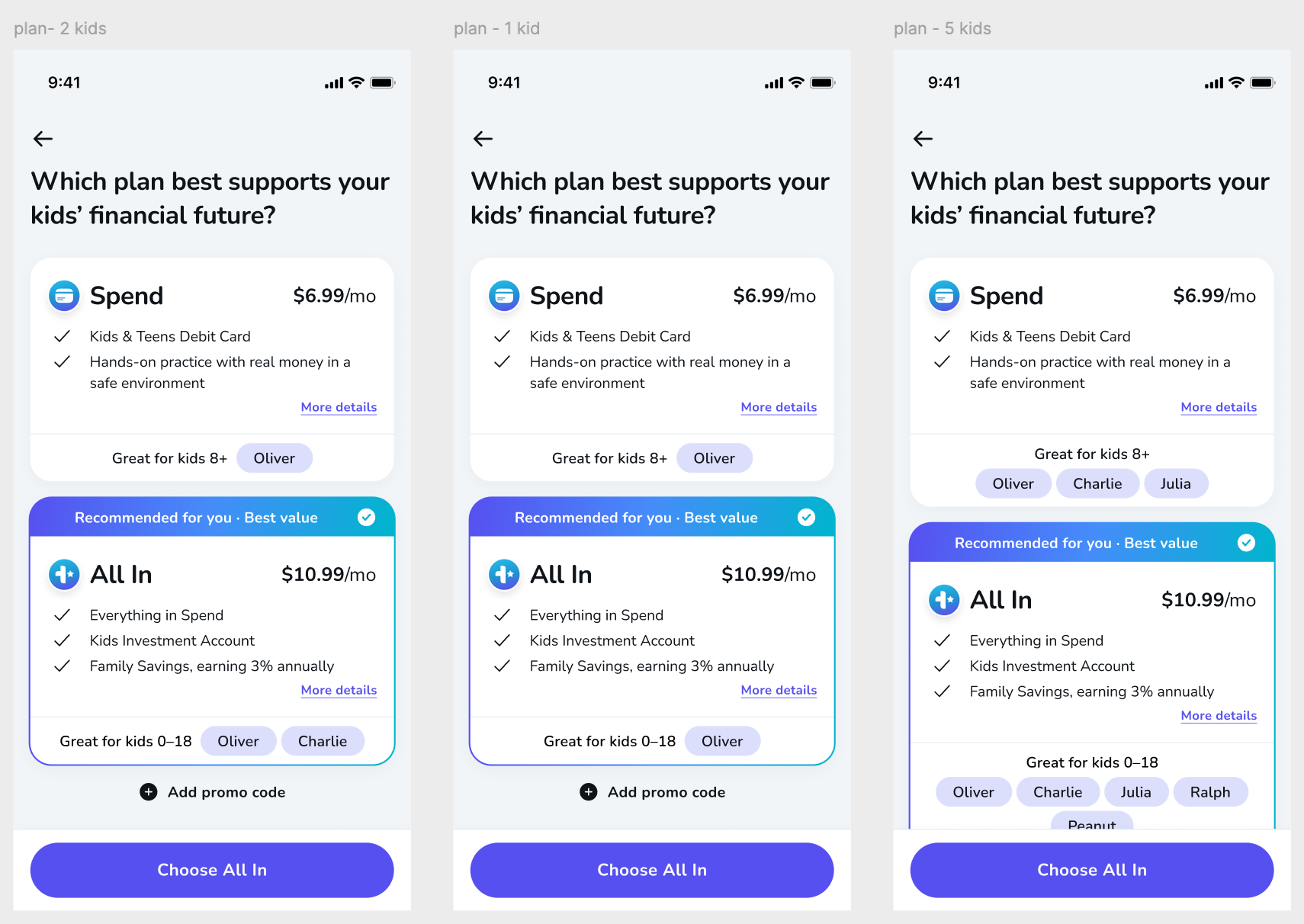
In the second iteration, my designer incorporated our design system and explored ways to make the experience feel more personal by incorporating the child's name.
She also explored a progressive disclosure approach: surfacing the most important plan information upfront, with additional details tucked behind a "More details" interaction.
Iteration 2 with details hidden under 'More details'
Expanded 'More details' view
My Feedback
I liked the overall direction, particularly the addition of the child's name and the plan navigation tabs. However, I felt we could simplify the experience further.
My feedback focused on a few areas:
Reduce unnecessary interactions: Did users really need to click into "More details" to understand a plan? I challenged the need for this additional step and suggested exploring whether we could surface all the essential information on a single screen.
Keep plan navigation intuitive: I liked the tabs at the top, which gave users a simple way to move between plans and compare their options without navigating away.
Simplify the visual hierarchy: The All In screen had too many competing uses of color that were drawing the eye all over the page. I suggested using more restraint with color to only highlight the most important information, which was the “Recommended” pill. Our research had found that 72% of users returned to the recommendation, so we wanted to use the opportunity to highlight this upsell opportunity for the business.
Tighten UI and content: I challenged my designer to look for opportunities to remove visual clutter—for example, removing unnecessary icons and bullets that were not adding to the experience. I tightened the copy to reduce word length whenever possible.
The common thread here was about making the experience feel less busy while ensuring users could access the information they needed without unnecessary clicks.
The Final Experience
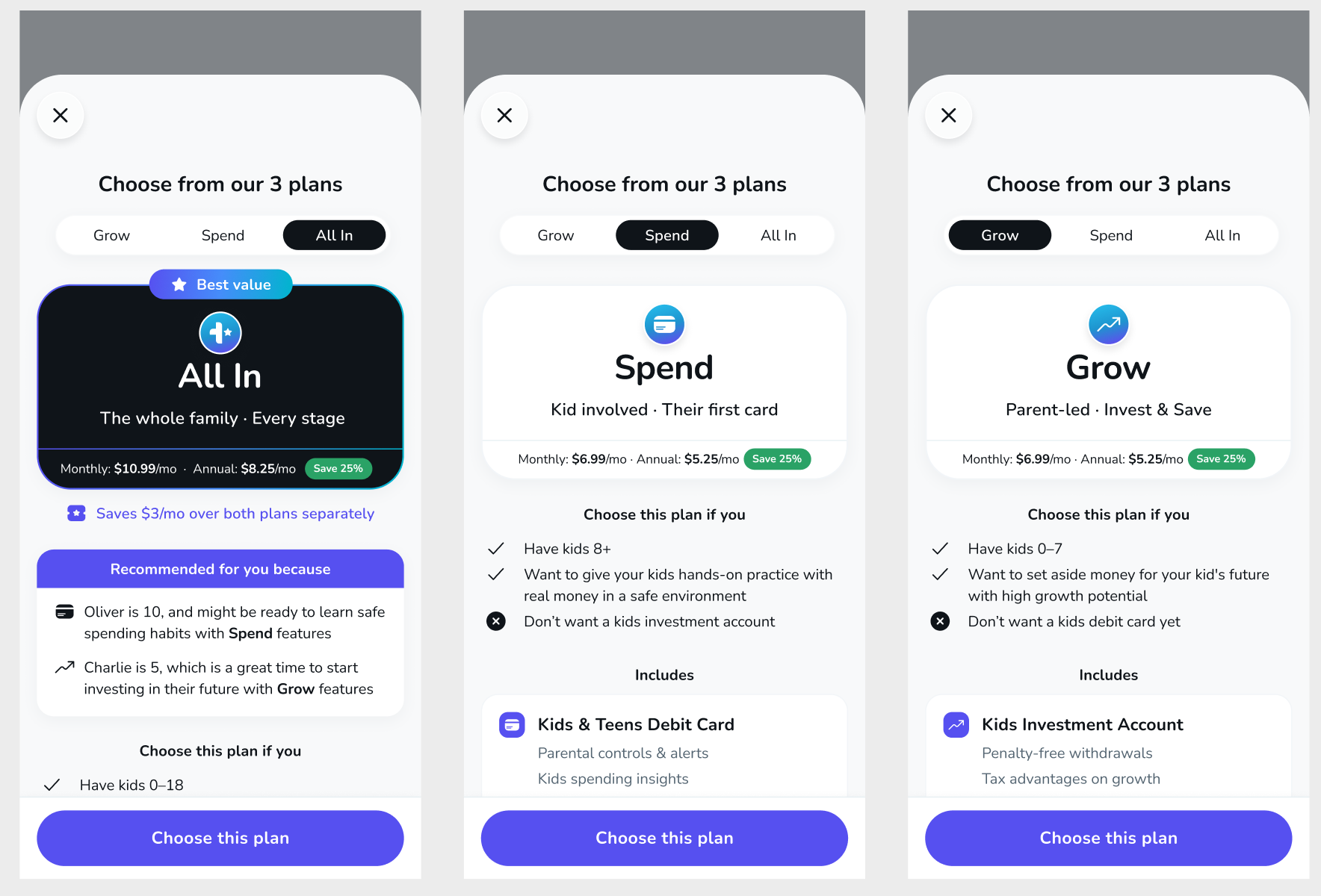
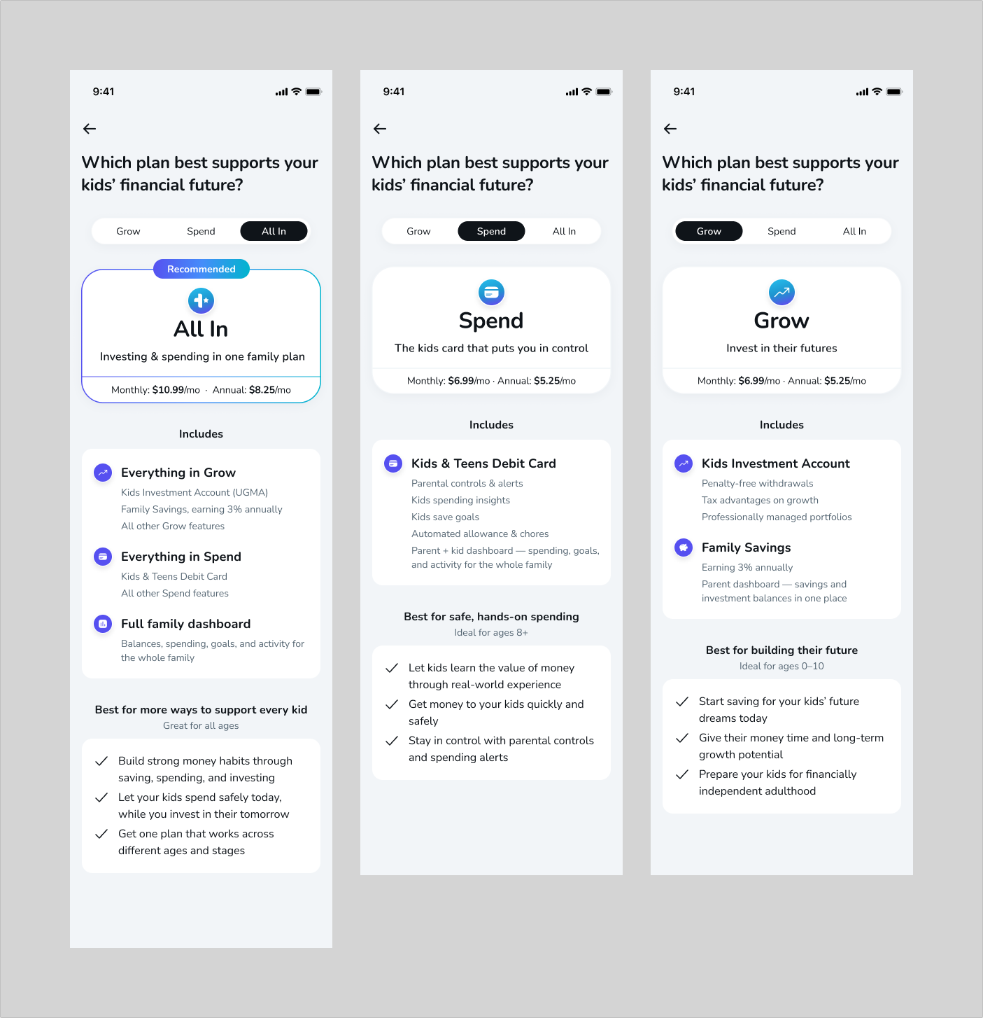
The final iteration incorporated this feedback, resulting in a more streamlined plan-selection experience.
Rather than hiding key information behind additional interactions, we brought the essential details onto a single screen and used tabs to let users move between plans and compare their options.
Each plan clearly surfaced five key pieces of information:
Plan name: Clearly identify each subscription option.
Quick summary: Communicate the core value proposition at a glance.
Pricing: Show monthly and annual pricing, including the savings associated with annual billing.
Plan details: Make the included products and features easy to understand.
Age and goals: Connect each plan back to the child's life stage and the parent's financial goals, reflecting the two key decision-making factors uncovered in our user research.
Final subscription selection screens
The Outcome
We translated a desktop-oriented subscription concept into a mobile-first sign-up experience that made it easier for parents to understand their options and select a plan.
The final design brought together the key learnings from our subscription research—particularly the importance of a familiar tiered structure, clear value propositions, and age and goals as decision-making cues.
My role was to guide the experience from strategy through execution, partnering with my Lead Product Designer to challenge assumptions, refine the information hierarchy, and remove unnecessary complexity.
The result was an experience designed to balance two important goals: helping parents make a confident subscription decision while creating a clear opportunity to surface and encourage the higher-value All In plan.
This design is ready for development, slated as part of a Q1 new subscription suite launch.