New product launch

I was the design lead on this 0-to-1 launch of a new product: an investment account for kids. I managed one in-house and two agency product designers.

👩🏻‍🏫 Team leadership
🧠 Design strategy
📊 Information architecture
🎨 UI / UX
🔍 User research
🤝 Cross-functional collaboration
🗣️ Stakeholder management
Hero Image of New Product Launch
OBJECTIVE

Launch a 0-to-1 product in a new industry: fintech

Fabric by Gerber Life, which operated exclusively in the life insurance/estate planning space, wanted to branch into fintech with a new product: an investment account for kids that allows a custodian to invest on behalf of their child while they're minors.

Constraints

Time Icon

Time

We only had 8 months to design and develop a new product in a new industry with unknown constraints.

To mitigate, we cut scope for launch to MVP-critical features only.

Resources Icon

Resources

We had a limited in-house team of 1 PM, 2 designers, and 8 engineers split between 2 products.

To mitigate, we worked with an agency providing dev and design resources for 4 months.

Vendors Icon

Vendors

We had to work with new vendors who each had their own requirements to move/hold money.

Balanced vendor requirements with UI/UX, to ensure a smooth user experience overall.

Legal Icon

Legal

Doing business in a highly regulated industry meant many rounds of Legal review and UAT testing.

Worked closely with Legal and Compliance to ensure designs met regulatory standards.

Process

Discovery Icon

Discovery

Market analysis, competitive audit, and user interviews

Architecture Icon

Architecture

Feature mapping, user journey, information architecture

Design Icon

Design

Low / mid / high fidelity design iterations

Development Icon

Development

Coding and design review with the Engineering team

Launch Icon

Launch

Soft launch to family & friends for bug testing, then launch in market

Process Visual
Discovery Icon

Discovery

Market analysis

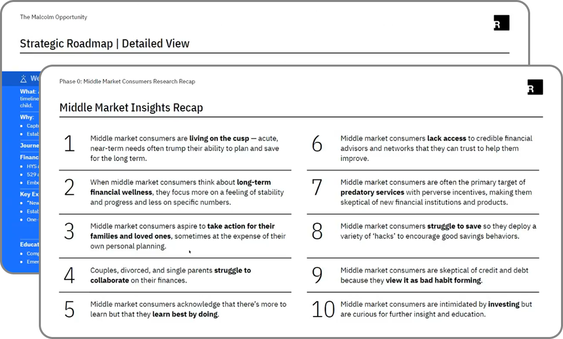
As an organization, we worked with a market research agency to analyze market trends based on our target demographic (middle market Millennial parents) and identify product expansion opportunities.

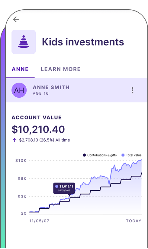
Outcome: An investment account for kids was identified as the top new product that our users would be interested in.

Market analysis chart showing demographic trends

Competitive audit

We ran a competitive audit of 9 fintech companies’ user dashboard experiences to identify common features and patterns that users would expect to see.

6 MVP features that users expect to see:


    1. High-level account summary
    2. Visual charts
    3. Detailed activities
    4. Edit deposits & payment method
    5. See/edit portfolio details
    6. Documents/statements

Competitive audit chart showing user dashboard experiences

User interviews

User interviews helped us identify our target user and their needs, and determine how to best position the product experience to them.

Key learnings:


    1. Simplicity: Users wanted a guided investment experience, without the complex jargon
    2. Feel-good focus: Users don’t really care about the nuances of investing—they just want to know that they’re doing something good for their child
    3. Penalty-free withdrawals: Users said this was the top benefit

Given the tight timeline, we ended up cutting scope and running user interviews post-launch. I’m including it here because this is ideally when we would have done them.

User quotes from interviews
Architecture Icon

Architecture

Features mapping

Working with Product and Engineering, we identified the key features in each section of the account experience, and prioritized them by Phase 1 (MVP), Phase 2 (fast follows), and Phase 3 (optimization).


Features mapping chart

Architecture & user journey mapping

Working with Product and Engineering, we mapped out how this new product would sit in the overall Fabric ecosystem, then pared it down to an MVP version to start, to help Engineering prioritize their workload.

Outcomes:


    1. Mapped out the sign-up flow for opening a new kids' investment account
    2. Defined key features of product dashboard (under My Account)
    3. Updated our onboarding quiz flow to include the new investment product
    4. Identified authentication requirements

Architecture and user journey mapping
Design Icon

Design

Lo-fi product dashboard

Below are wireframe iterations exploring how information should be presented on the main product dashboard page. I explored several iterations, some showing more information on the dashboard v. less information. I knew that I wanted to lead with a chart visual: not only was it a common pattern that we saw in our competitive audit, the team and I felt that it was a strong trust-building element—this was later confirmed via user testing. From a UX perspective, the team felt that the top level experience should show a summary view only, and focus on the key actions we want a user to perform (i.e.: make a contribution, give a gift), so as not to overwhelm the user.


Lo-fi product dashboard wireframe

Mid-fi product dashboard

Now that we had the parent page designed, we needed to lay out the child pages according to the architecture that we had discussed with Product and Engineering. Because this project was ever-changing, we working closely with Product to update designs when new information or requirements were presented.


Mid-fi product dashboard wireframe

Final product dashboard

This was the final dashboard that went into prod. It was a highly cross-functional effort between Design, Product, and Engineering to balance UI/UX and dev resources to hit the aggressive launch timing.


Hi-fi product dashboard wireframe

Development Icon

Development

We’re all in this together

Due to the complexity of this product launch, the team and I worked hand-in-hand with Engineering, as we needed to understand the constantly changing technical constraints. This was certainly not a linear process—it was more like one of those detective maps with all the string criss-crossing everywhere. Because this was a new industry with many constraints, we were learning as we went, with Engineering working on the backend while Design mapped out the frontend experience.

How we managed the unknown:


    1. Weekly meetings between Design, Product, and Engineering
    2. Design walkthroughs at multiple points in the process, not just at final design (according to need and complexity)
    3. Iterative development in which the product experience was chunked out and passed off piece-by-piece
    4. Regular design reviews before pushing to prod
Launch Icon

Launch and learnings

Results

Successfully launched new product on-time!

    1. 📈 Total new Fabric accounts increased by over +300% in the first year
    2. 📈 User acquisition with the new kids investment account product is 3x greater than the original life insurance
    3. 📉 CAC with the new kids investment account product is 85% less than life insurance, meaning marketing dollars are more efficient

Learnings

📝 Prioritize more time early on for proper product discovery and user interviews

      Although we launched on time, we sacrificed quality for delivery by shortening our product discovery and user testing time with our aggressive timeline. We spent much of the next year working backwards to improve the product experience and refine our positioning. We could have saved a lot of time and manpower if we had allocated time for more user testing beforehand.

📝 Don’t skip due diligence just to hit a timeline

      Because of the tight delivery timeline, we did not implement the proper UX to deter fraud in money movement. As a result, the company incurred loses due to fraud schemes that could have been prevented if we were not so focused on acquisition and took the time to create a more robust money movement system. Ultimately, this would have resulted in a better product experience for both the company and the user.
Previous Arrow
Previous
Next
Next Arrow