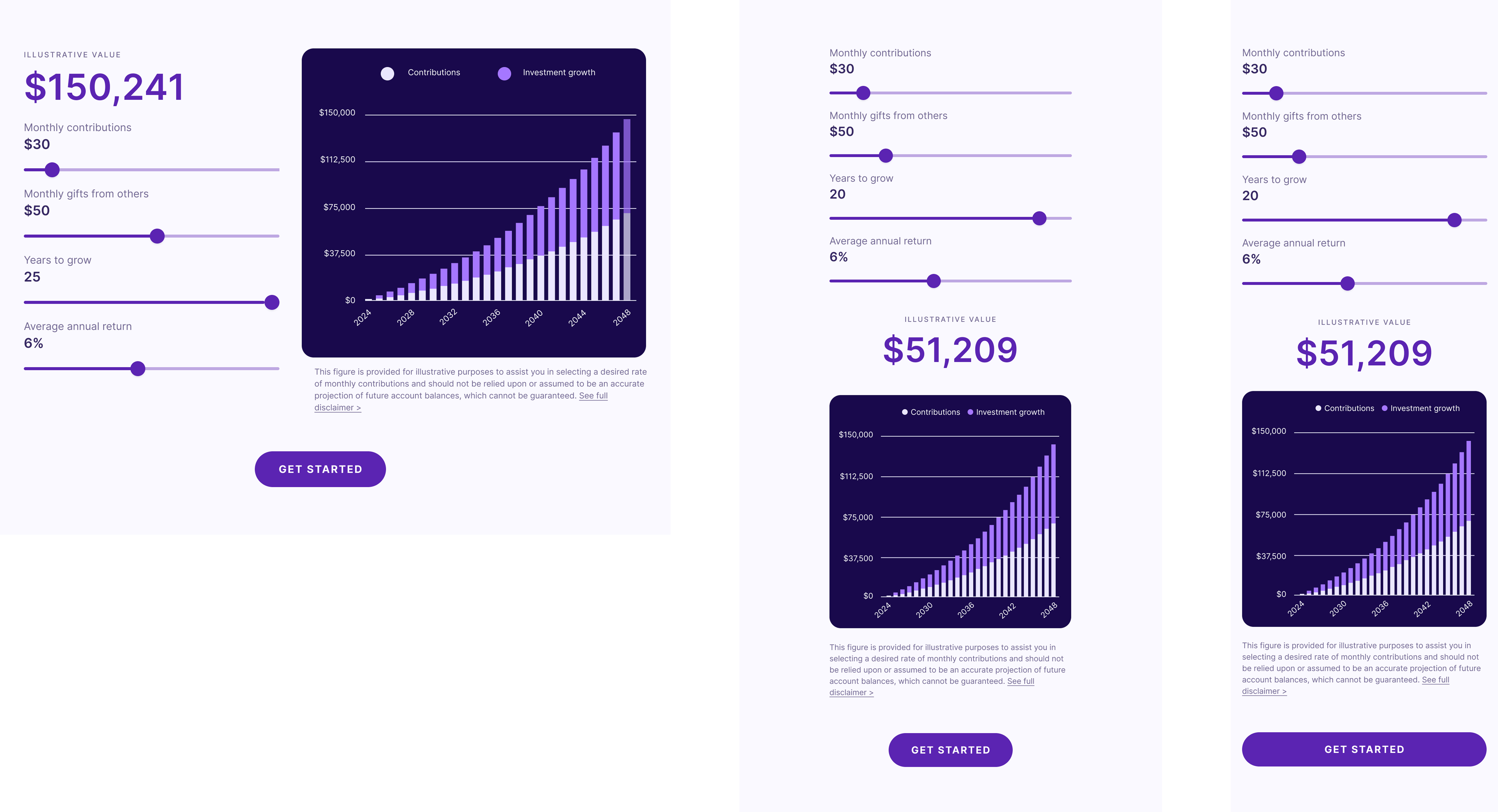
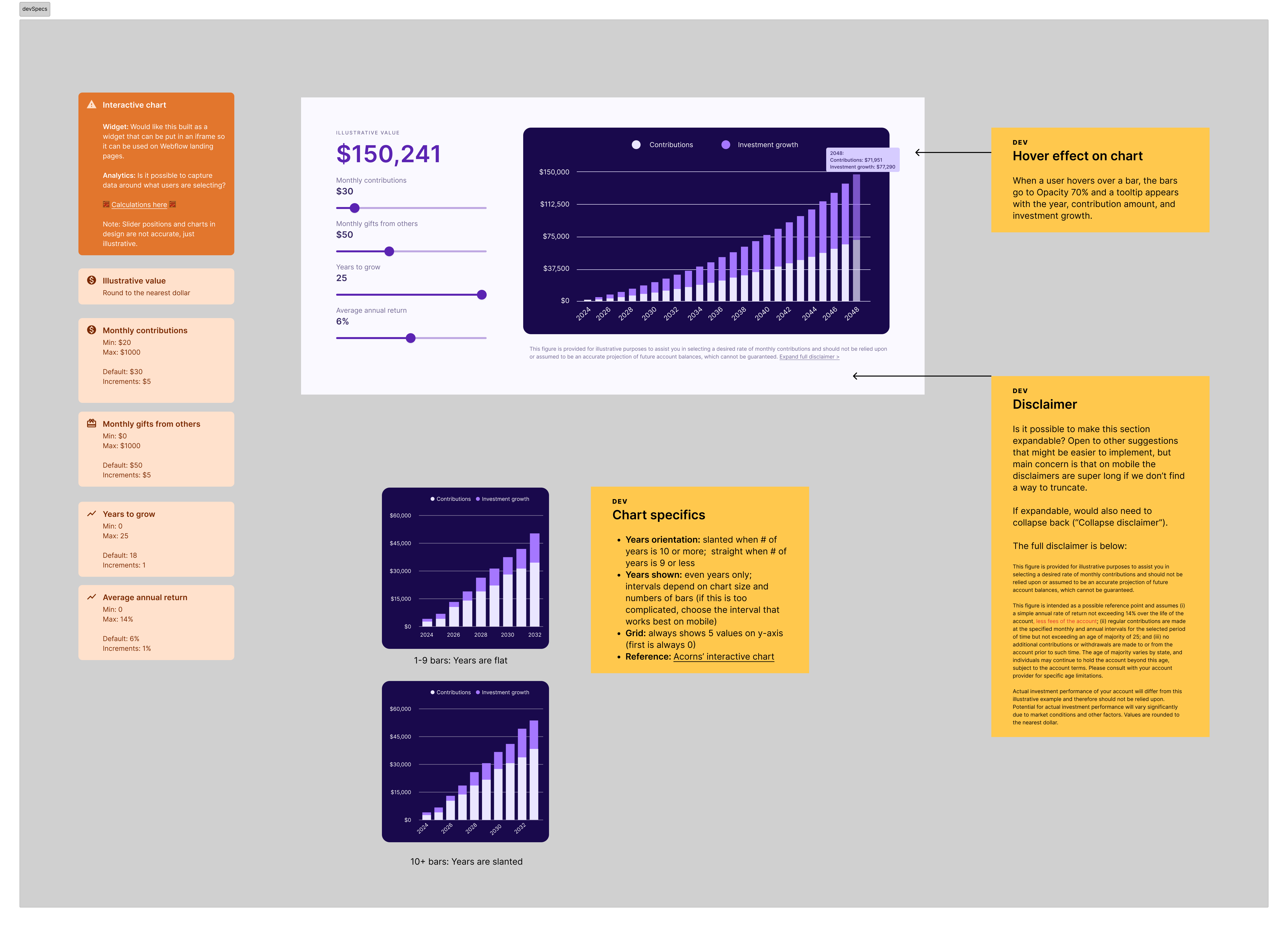
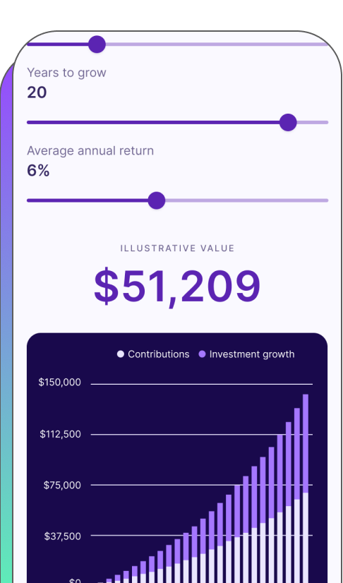
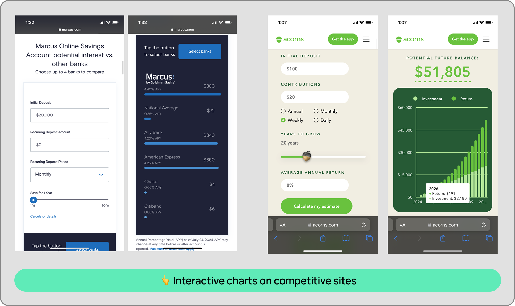
Interactive returns chart

I led as both the lead designer and the PM on this interactive design element that highlighted potential investment returns.

πŸ«† Interactive design
🎨 UI / UX
πŸ” UX research
🀝 Cross-functional collaboration
Interactive Chart
Objective Icon

Objective

Help users see the value of opening a kids investment account.

Users were hestitant to open an investment account for their child because they were unsure of the potential returns.

Constraint Icon

Constraint

Needed Legal & Compliance sign off on the rates and parameters shown.

Worked closely with Legal and Compliance to ensure designs met regulatory standards.

Process

Discovery Icon

Discovery

User research and competitive audit

Design Icon

Design

Wireframes, user testing, iterations, final hi-fi designs

Collaboration Icon

Collaboration

Feedback from cross-functional teams and stakeholders

Development Icon

Development

Design review with Engineering team

Launch Icon

Launch

Interactive chart goes live on the marketing site and within the product experience

Process Visual
Discovery Icon

Discovery

User research

While conducting a series of user tests (interviews, surveys, and usertesting.com) to gauge user needs with our kids investment account product, we kept hearing the same feedback from users: "How will my money grow?" Our Customer Support team also reported that this was a common question from users.

User research

Competitive audit

We looked at how other fintech companies answered this question and settled on an interactive chart as the best solution, given all the variables that went into calculating a user's potential return.

Competitive audit
Design Icon

Design

First iterations

I acted as both the lead designer and the product manager on this project, identifying the product parameters, inputs, and calculations needed to create the interactive chart.

I identified the key variables that would affect the user's potential return:

  1. Contributions
  2. Gifts
  3. Years to grow
  4. Average annual return

I went with sliders because we heard from users that they tend to not have a specific input in mind. Rather, they want to see how different inputs affect their potential return.


First design iteration
Collaboration Icon

Collaboration

Legal review

We recommended a default rate of 7% (up to 16%), and a max number years of investment of 40 years. This was signficantly more conservative compared to our competitors, which capped the rate of return shown at 99% over 65 years.

Legal originally wanted the range to default to 4% (up to 10%), with max 18 years, which we pushed back on, since a high rate of return on investments throughout adulthood was one of the main benefits of a kids investment account. If a user could get a guaranteed 3-4% return on a high yield savings account, why would they choose the riskier option of opening an investment account?

I brought key stakeholders together to negotiate a compromise that would satisfy both the business and regulatory requirements. We were ultimately able to get Legal to agree on a default min rate of 7% (with a max of 14%), over a time period of 25 years.

Design Icon

Design

Final design

Final designs with breakpoints for multiple screen sizes.


Final interactive chart Final interactive chart breakpoints
Development Icon

Development

Engineering review

In my hand-off to dev, I included all parameters of each slider, including notes on interaction effects and references where dev could view the desired chart effects. In addition, I outlined different use cases that would affect the chart UI (i.e.: years were displayed horizontally if fewer than 9 years were selected, and displayed at a slant if more than 9 years were selected). During development, I stayed in close communication with my engineer to ensure smooth development.


Final interactive chart
Launch Icon

Launch and learnings

Results

Successfully launched new interactive chart on-time!

  1. πŸ“ˆ Account creation starts increased +5% within the first month of launch
  2. πŸ“‰ Customer Support reported a 50% decrease in the number of customer tickets asking about returns
  3. πŸ™Œ The interactive chart has been implemented in other places in the product flow and remains one of our most compelling conversion tools


Learnings

πŸ€– Utilize AI to help with interaction prototyping

      With the tools that we have now, I would have used AI to help me prototype the interaction effects of the chart. While I was able to provide a reference of the interaction effects that I wanted to my developer without any issues, if I were redoing this project today, I would have used AI to help speed up the hand-off process.
Previous Arrow
Previous
Next
Next Arrow