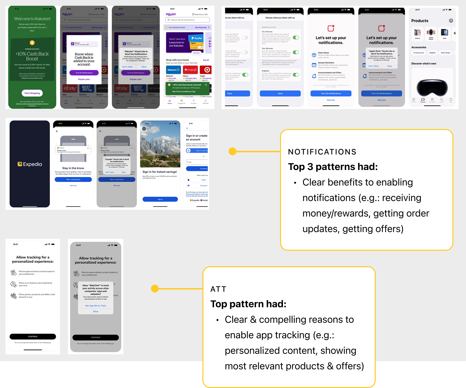
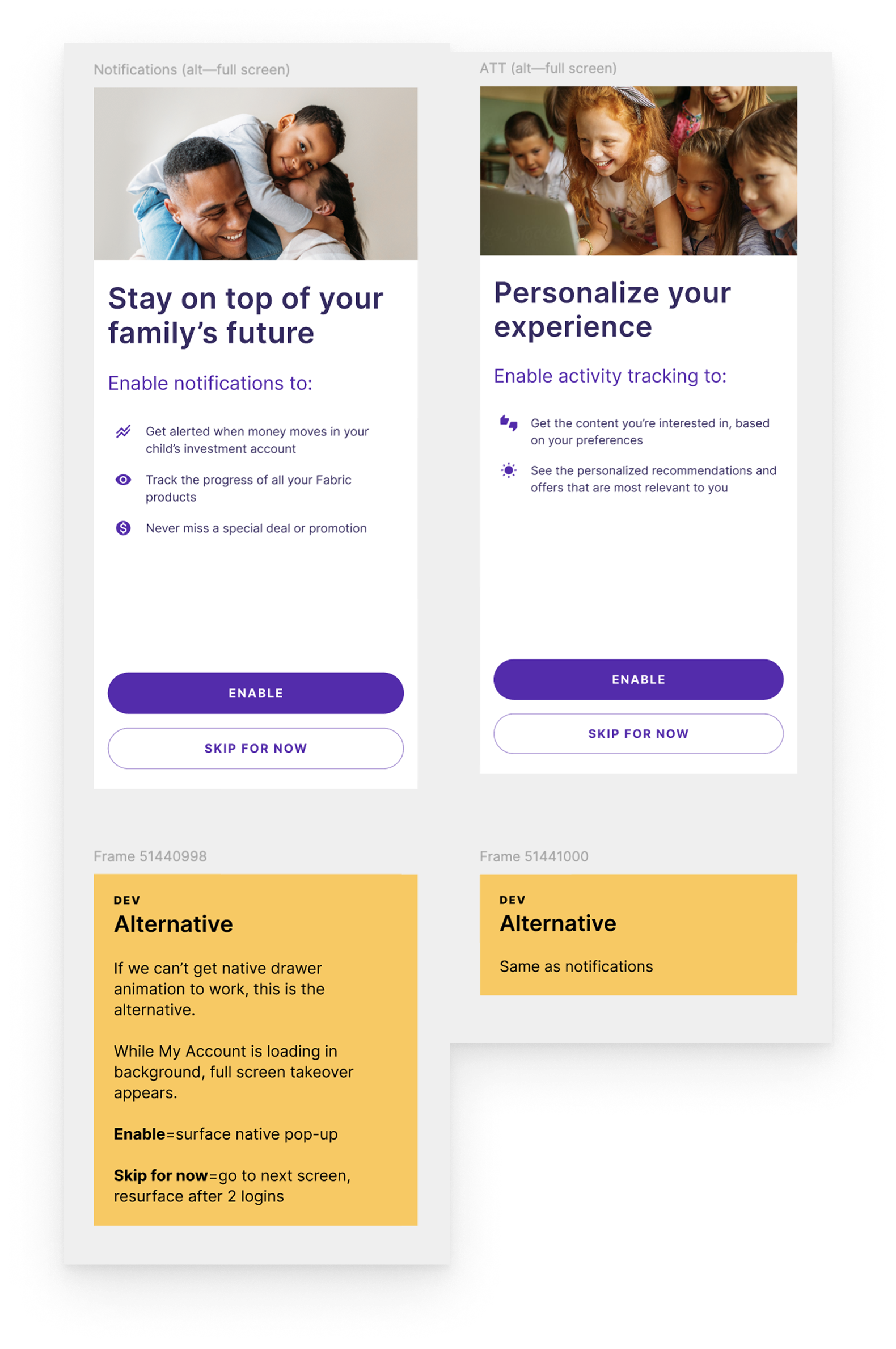
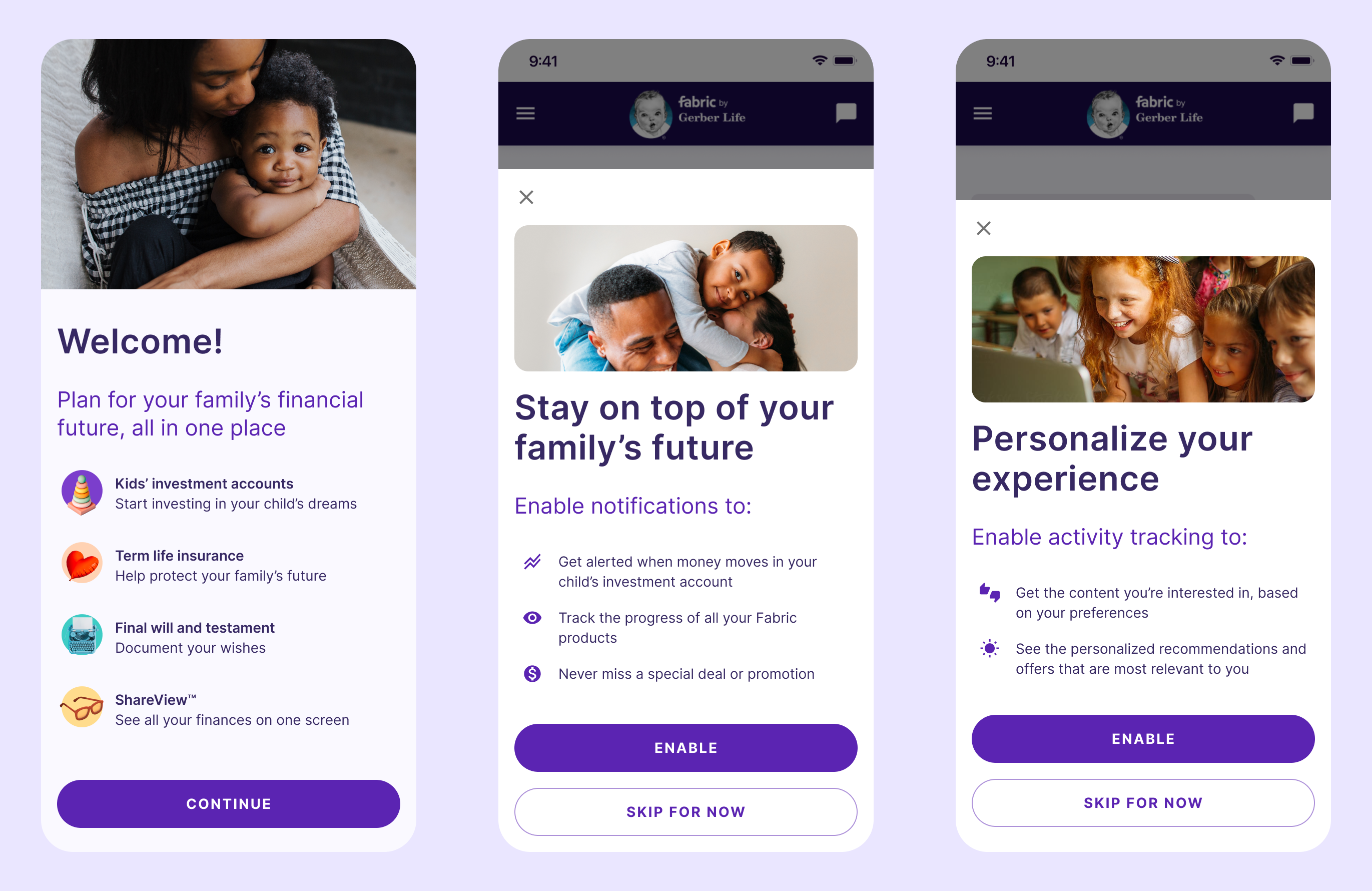
Mobile app onboarding

I led as both the lead designer and the PM on this 1-to-n improvement to our mobile app onboarding experience, which introduced notifications and app tracking transparency.

📱 Native app design
🎨 UI / UX
📝 UI / UX copy
📝🔍 UX research
🤝 Cross-functional collaboration
Mobile App Onboarding Image
OBJECTIVE

Create a mobile onboarding flow that was both compelling for the user and simple enough for a small engineering team

We had one chance to get users to opt-in to notifications and app tracking transparency (ATT) on the mobile app. If a user declined either prompt, we could not surface it again, which would hinder the ability of the business to market to users.

Constraints

Time Icon

Time

We were given 2 weeks to design and test a new onboarding flow

To mitigate, we focused on the most essential screens and user flows.

Resources Icon

Resources

We had only 1 engineer and 1 sprint available for development

To mitigate, I designed a simple flow with minimal screens and interactions.

Process

Discovery Icon

Discovery

Competitive audit

Design Icon

Design

Wireframes, user testing, iterations, final hi-fi designs

Collaboration Icon

Collaboration

Feedback from cross-functional teams and stakeholders

Development Icon

Development

Design review with Engineering team

Process Visual
Discovery Icon

Discovery

Competitive audit

I researched the way other companies handled notifications and ATT to establish patterns that users were used to seeing.

I used Mobbin to view onboarding flows from other companies and identify the patterns that would work best for our mobile app user.

Competitive audit
Design Icon

Design

Iteration 1

The first iteration of the onboarding flow featured the new notification and app tracking transparency screen and focused on the flow, an interactive pop-up drawer, and the content.


First design iteration
Collaboration Icon

Collaboration

Internal review

I reviewed my initial design with the design team for feedback during design crit.

Because notifications and ATT were marketing-specific requests, I also reviewed designs with the Marketing team.

Outcomes:


    1. Added an intro page highlighting Fabric’s products for users who find the app organically, not via the website
    2. Added brand imagery to the notifications & ATT screens
    3. Edited the copy and UI based on feedback
Design Icon

Design

User testing

We tested designs with users on usertesting.com.


Testing results:


    1. 5/5 users said that seeing the Welcome screen made them want to continue
    2. 5/5 users said that seeing the notifications page made them “very likely” to enable notifications
    3. 4/5 users said that seeing the ATT page made them “very likely” to enable ATT
    4. 3/5 users liked the personalized experience that ATT gave them, while 2/5 users expressed hesitations around it

Given the strong results overall and the tight timeline, I felt confident moving forward with the designs.


User Quotes
Development Icon

Development

Engineering review

I reviewed updated designs with the engineering team, for feedback on interactions and edge cases.

We identified:


  • The behavior of the drawer and the My Account screen loading behind it
  • What action occurs with each click:
    • “Enable”
    • “Skip for now”
    • “X” (close)
    • Grey area behind drawer
  • When the user exits or clicks “Skip for now,” we would resurface the prompt after 2 logins, to give them time to gain some value from the product

Instructions for engineers

Engineering contingency

Engineering was unsure if they could make the drawer interaction work in the time allotted, so I created a secondary option featuring full-screen takeovers as an alternative.

Contingency instructions for engineers
Design Icon

Design

Final design

Unfortunately, this project was deprioritized as the company shifted focus away from the mobile app experience, but the final design remains ready for development. View the prototype here.


Final design
Previous Arrow
Previous
Next
Next Arrow