New design system

Championed a design system overhaul that gave the company the technical ability to 10x the business after its introduction.

šŸ‘©šŸ»ā€šŸ« Team leadership
🧠 Design strategy
šŸŽØ UI / UX
šŸ“Š Information architecture
šŸ¤ Cross functional collaboration
Interactive Chart
OBJECTIVE

Implement a scalable design system

Fabric’s original component library was custom-built from brand guidelines and not a true design system. Because of this, designs lacked consistency, leading to both design and development inefficiency as every page was custom-built. The system was also not WCAG-compliant.

Constraints

Handshake Icon

Buy-in

Leadership did not see the value in implementing a new design system

I found an ally in a Staff Engineer who helped me champion the benefits of a design system. After several months of building the business case, I was finally able to get buy-in from Leadership.

Resources Icon

Resources

Our engineering team’s capacity was slim—we needed a low effort solution

I worked with my Staff Engineer to identify both engineering and design needs and land on a solution that both teams could implement and update as needed.

Time Icon

Time

We had just one quarter to bring our design system to life

We took advantage of a lull in the year to convince the company to prioritize a design system and built on top of Google’s Material UI for faster implementation.

Process

Discovery Icon

Discovery

Market analysis and internal audit

Architecture Icon

Architecture

Building the visual hierarchy

Design Icon

Design

Expanding our toolkit of components

Development Icon

Development

Working with Engineering on implementation

Launch Icon

Launch & learnings

Initial design system and improvements made post-launch

Process Visual
Discovery Icon

Discovery

Market analysis

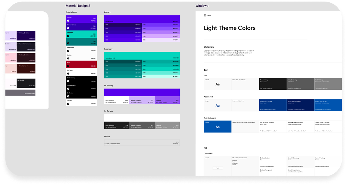
We looked at well-known design systems for inspiration, such as IBM’s Carbon, Atlassian, Mailchimp, and Google’s Material Design.

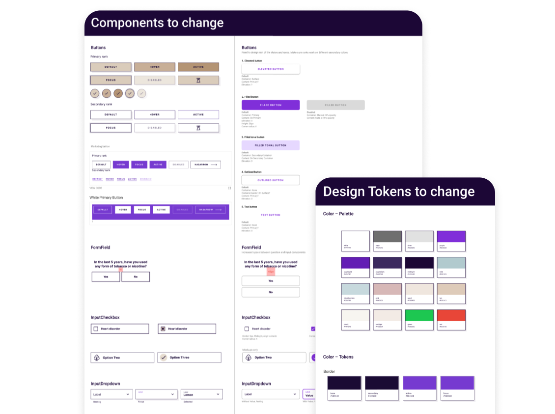
Ultimately, after consulting with Engineering, we decided to build a custom adaptation of Material Design 2 by Google. To implement, we used the React component library Material UI (MUI), which allowed us to move quickly and utilize industry best practices.

Competitive audit

Internal audit

We conducted an audit of our current system and identified our most commonly used components and design tokens that needed to be updated. Luckily, at that point, we only had one product and therefore a limited set of both. However, I knew that the new design system would be crucial to our ability to scale the platform.

Internal audit
Architecture Icon

Architecture

Design tokens: Rebuilding the foundation

We took our internal audit results and started by addressing issues with our foundational design tokens. Our key focus was on scalability—we were not just building the foundation for our current life insurance product, but the foundation for future products as well, so we wanted to give ourselves options that could scale as we grew.

Key changes we addressed were:

    1. Color accessibility: a limited color palette made accessibility difficult—we needed to expand into a tonal palette to give us more accessible combinations.
    2. Typographical hierarchy: we had a separate set of typography tokens for mobile and desktop. We merged them into one set that would work across multiple screen sizes for both Product and Brand.
    3. Spacing, radii, surfaces: we updated all our design tokens to be more consistent and scalable, ensuring they could adapt to different contexts and use cases.

    As an example, here was the previous color palette. It was originally built for Brand only and shoehorned into the product experience. The limited nature made accessibility and scalability difficult.

    Old color palette

    Here is the updated color palette that I built, which consists of multiple tones and shades but retaining the brand’s signature purple color. This new palette makes it easy to create accessible components and patterns across both Product and Brand design.

    New color palette

    We went through our entire inventory of design tokens, creating an accessible, consistent, and scalable system of typography, spacing, radii, and surfaces. We also identified tokens for various states, such as error, warning, success, and hint states.

    Color variables
Design Icon

Design

Updating components & patterns

With our new foundation of design tokens, we began updating our components and patterns. Below is an example of one of our most commonly used patterns for the life insurance application flow: a question with a boolean response.


Old UI

Here is the updated UI, which offers a clearer user experience, decreasing cognitive load and optimized for mobile, our most commonly used viewport.


New UI
Development Icon

Development

Engineering collaboration

Engineering was one of our key allies when it came to getting the design system overhaul on the roadmap, and we continued to work closely throughout the entire process.

How we managed the process:


  1. Weekly meetings between Design and Engineering
  2. Design changes were made to simplify developer implementation, while not jeopardizing the user experience
  3. Iterative development: changes were chunked out and passed off piece-by-piece
  4. Design would review and test updates before pushing to production

Launch Icon

Launch and learnings

Results

We launched our new design system, called ā€œBoltā€ (like a bolt of fabric) within one quarter. Since then, it has allowed us to:

  1. šŸ“ˆ Scale our product suite: we introduced a new product within a year of launching Bolt.
  2. šŸ“ˆ Design faster: a thoughtful foundation of design tokens makes it easier for designers to build new components and patterns as our product experience expands.
  3. šŸ“ˆ Develop faster: developers no longer have to custom-build every component; and because designs now have consistency, they can spend less time inspecting designs and more time coding.


Learnings

Since launch, we are constantly learning and improving our design system:

      šŸ“ A design system is never done—it needs to be maintained

      My designers were noticing a lack of communication between the different engineering teams, leading to bloating in Bolt as duplicate components were made. Even though my designers were sharing component knowledge with one another, it wasn’t translating to the engineering team. I surfaced this issue to the Engineering Director and we came up with the idea of the ā€œBolt Working Group,ā€ an assembly of engineers from the different product teams that would meet regularly to maintain Bolt documentation. New components would be run by this group, to ensure that the component was not a duplicate, which improved clarity between the engineering teams.

      šŸ“ Design doesn’t end at hand-off

      We discovered that engineers were sometimes implementing new components/patterns into Bolt without consulting Design, which also led to bloat. I realized that Design was contributing to this by not explicitly calling out new components/patterns. I implemented a new process for my design team, in which they specifically called out new components/patterns to be built and identified its simplest form for the developers during hand-off.

      For example, if a new button was created for one product specifically to trigger an API call on the backend, that new button component should be implemented in Bolt as just a button, without the trigger. That way, our other product teams could also use the component. What was happening was that the button with the API trigger was being built as one component and put into Bolt, which meant that it could only be used for a specific instance—not as a true design system component. While this would normally be caught by the Bolt Working Group, they did not always have the context that we did in Design, nor did the timing of their meetings always coincide with development timing.

      As the Head of Design, I like for my senior-level designers to have visibility and ownership across the entire product experience, including development. I don’t want them to just hand a project off and be done with it—I believe that the key to a successful Product organization is when designers understand their cross functional impact and partner with other parts of the organization.
Previous Arrow
Previous
Next
Next Arrow